When we moved into this house the rooms felt shorter than they measured. The ceilings were a normal height. Nothing was actually wrong. It just read low, and for a while I could not work out why.
It was everything on the walls. The previous owners had hung the curtain rods a few inches above the window frame, which is where most people hang them. There was a small horizontal television over the fireplace. Every object in the room sat at eye level or below, so your eye never traveled upward, and a room where your eye never travels up feels like a box.
Almost nothing I changed cost much. It was mostly about moving things higher, choosing shapes that pull upward, and letting a couple of mirrors do the rest. Not one of these changes involved construction.
Everything in these photos is shoppable. Tap any photo and it opens with every piece in that picture tagged.
One. Hang the curtains at the ceiling, not at the window
This is the single biggest change I made and it is the one people notice without knowing what they are noticing.
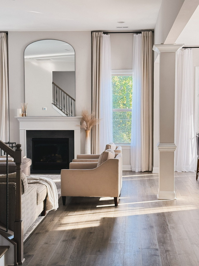
The rods go as close to the ceiling as the molding allows, not a few inches above the window frame. The curtains then run the full drop and just brush the floor. What this does is simple. It draws a continuous vertical line from the ceiling down, and your eye reads that whole line as the height of the room, rather than reading the shorter line of the window.
The window does not get bigger. The wall does.
Two details matter as much as the height. The panels need to be wide enough that they look gathered rather than stretched, and they need to reach the floor. A curtain that stops short undoes the whole effect, because it puts a hard horizontal line partway down the wall, which is exactly what you were trying to avoid.
Any line that runs across a wall cuts the room shorter. Any line that runs up it makes the room taller. That is most of this post in one sentence.
Two. A mirror is doing two jobs, and most people only use one
Everybody knows a mirror makes a room feel bigger. What gets missed is that the shape of the mirror decides which direction it grows in.
Vertical shapes lift
Above the fireplace I hung an arched mirror where that small horizontal television used to be. The arch is the part doing the work. It carries the eye up and then over, so the chimney breast reads as a tall feature instead of a flat panel with a box on it. The reflection is a bonus. The shape is the point.
Horizontal shapes widen
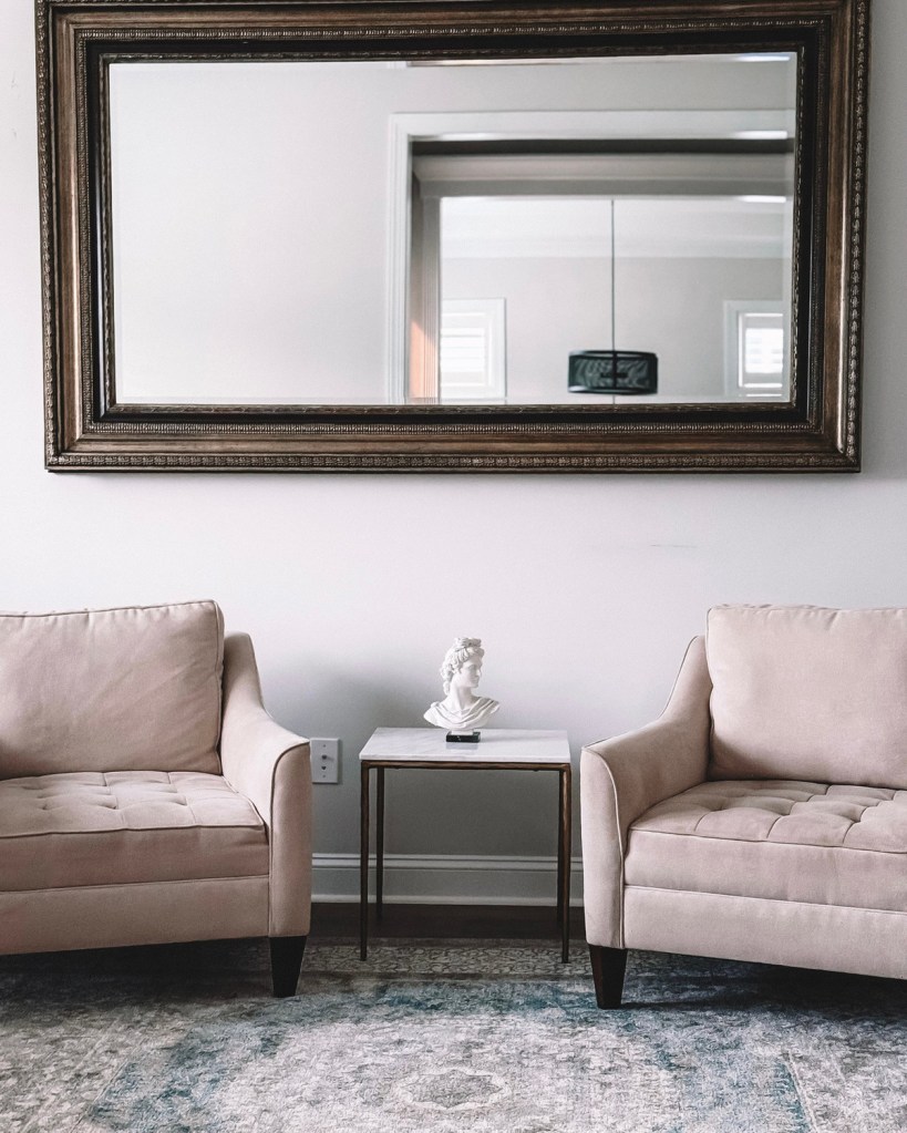
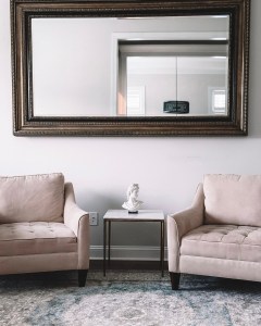
In the office the mirror is wide and rectangular, because that wall did not need height, it needed breadth. A horizontal mirror above a pair of chairs stretches the arrangement sideways and makes a narrow wall read wider than it is.
In lower light, a mirror works twice as hard
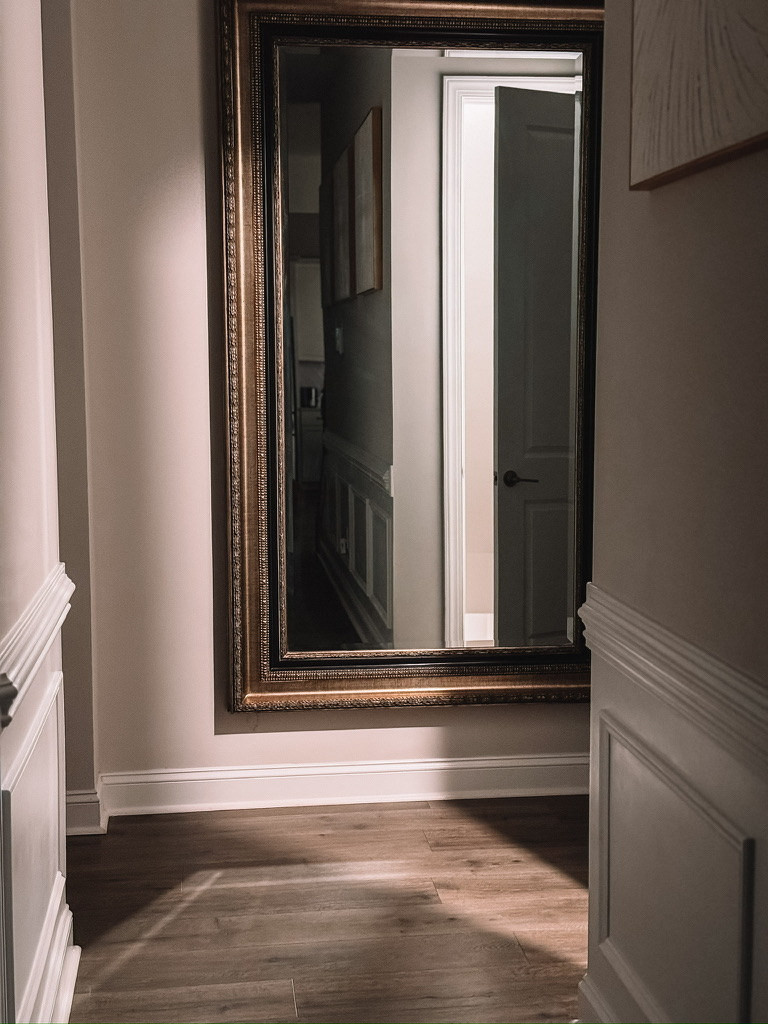
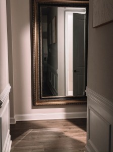
Depending on where the sun sits, our hallway goes fairly dim for a good part of the day. A mirror there is not about proportion at all. It picks up whatever light is coming in from the rooms on either side and sends it back down the passage, and at the same time it pushes the wall away, so a narrow space reads wider and deeper than it measures. Light and volume, from one piece.
So before you buy a mirror, decide what the wall is short of. Height, width or light. The answer changes the shape you should be looking for.
Three. Symmetry sets the order, then you break it with height
Two of the same thing, evenly spaced, reads as a decision. One of everything reads as whatever was left over. That is why a pair of chairs under a centered mirror settles a corner so quickly.
But perfect symmetry on its own goes flat, because everything sits at the same level and your eye has nowhere to travel. The fix is to put something between the pair at a different height. In the office that is the little marble table with the bust on it. The table is lower than the chair arms, the bust sits above them, and suddenly there are three levels in an arrangement that was two.
Symmetry gives you order. Height variation gives you interest. You want both.
Four. When the colors are quiet, line and texture have to carry it
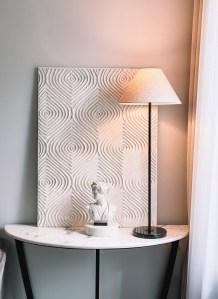
The console is the cleanest corner in the house. Black metal, white marble, a black lamp with a plain linen shade. Almost no color at all.
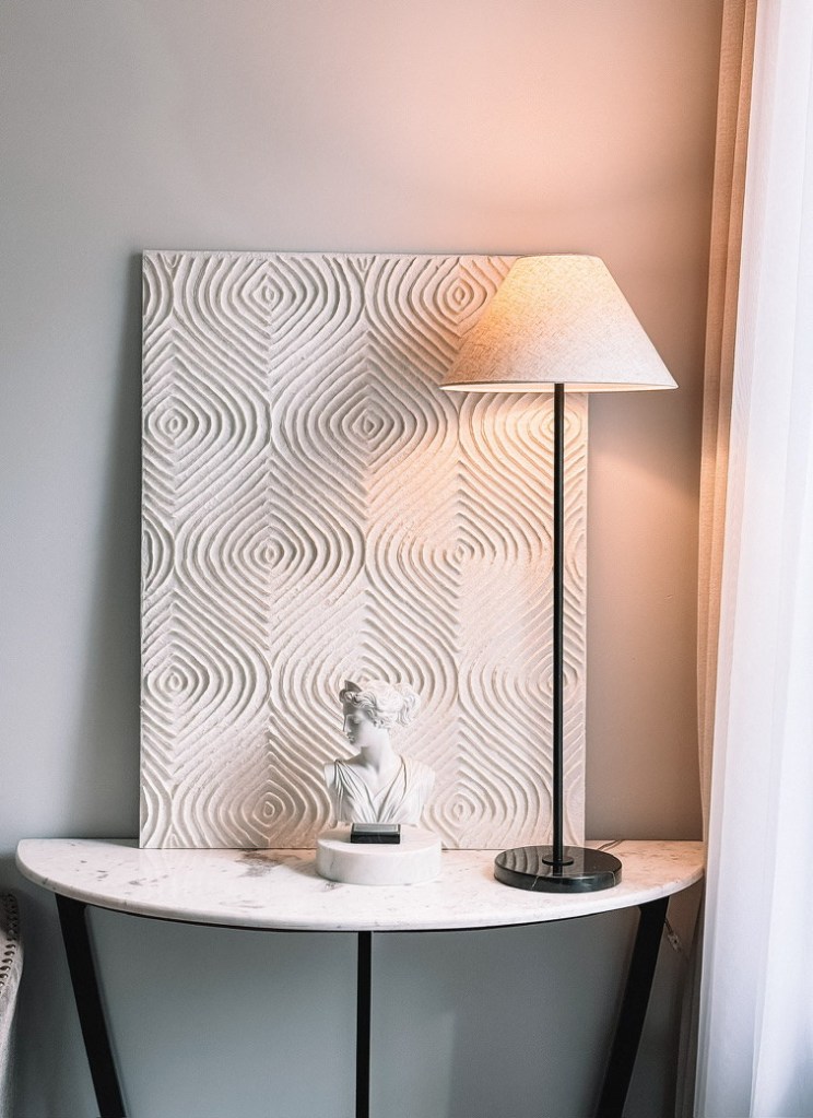
It looks simple and it is not. Look at what is actually doing the work.
The art panel is a carved geometric pattern, so even though it is white on white it has deep relief and it throws shadow. That pattern is what keeps the corner from being boring, not color. The marble has its own veining, which is another pattern again. The lamp is dead straight and plain on purpose, because something in a group of three has to be quiet.
Then there is the bust, which is the only old thing on that table. A classical piece against clean modern lines gives a corner a bit of history, and stops a minimal palette from feeling like a showroom. One old object in a modern room is usually enough.
Take the color out of a room and you are left with line, texture and material. Those three have to be good, because there is nothing to hide behind.
Five. Buy the thing twice
There are two of that rectangular mirror in this house. One in the office above the chairs, one in the hallway. I did not plan it. I bought the second one because the first one worked.
It taught me something I had been getting wrong for years. A piece does not have a fixed character. In the office that mirror anchors a seating arrangement. In the hallway the same mirror opens a dark passage. Nothing about the object changed. Only what was around it.
The same is true of the bust, which is a focal point alone on a small table and a supporting height on a busy console. And of the chairs, which read as a conversation facing each other in the office and as part of the architecture in the living room.
So when something earns its place, consider buying it again rather than hunting for something different for the next room. Repetition across a house is a large part of what makes a place feel considered rather than assembled.
The short version
- Curtain rods to the ceiling, panels to the floor.
- Vertical shapes to lift a wall, horizontal to widen one.
- Mirrors in dark spaces, where they work as light.
- Symmetry for order, then three heights for interest.
- With no color, line, pattern and material do everything.
- One old piece in a modern room.
- When something works, buy it twice.
None of this required a builder. It required moving a curtain rod about fourteen inches and thinking about what each wall was actually short of.
If you try one thing from this list, make it the curtains. It costs the least and it changes the most.
Shop this post
Everything in these photos, grouped by room. Tap one and every piece in that picture is tagged.
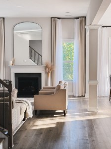
- The living room, the arched mirror, the curtain rods, the curtains, the floor vase, the dried stems, the throw and the reed diffuser
- The office, the rectangular mirror, both chairs, the marble side table and the bust
- The hallway, the second rectangular mirror
- The console, the marble console, the geometric art panel, the table lamp and the bust
The links are affiliate links and I may earn a small commission.
If you are working through one room at a time, the laundry room is the other one I have written up, and it is the same thinking applied to a much smaller space.
Now tell me yours. Which wall in your house do you walk past every day and still have not worked out? Leave it in the comments with what the room is short of, height, width or light, and I will tell you what I would try.


Leave a Reply